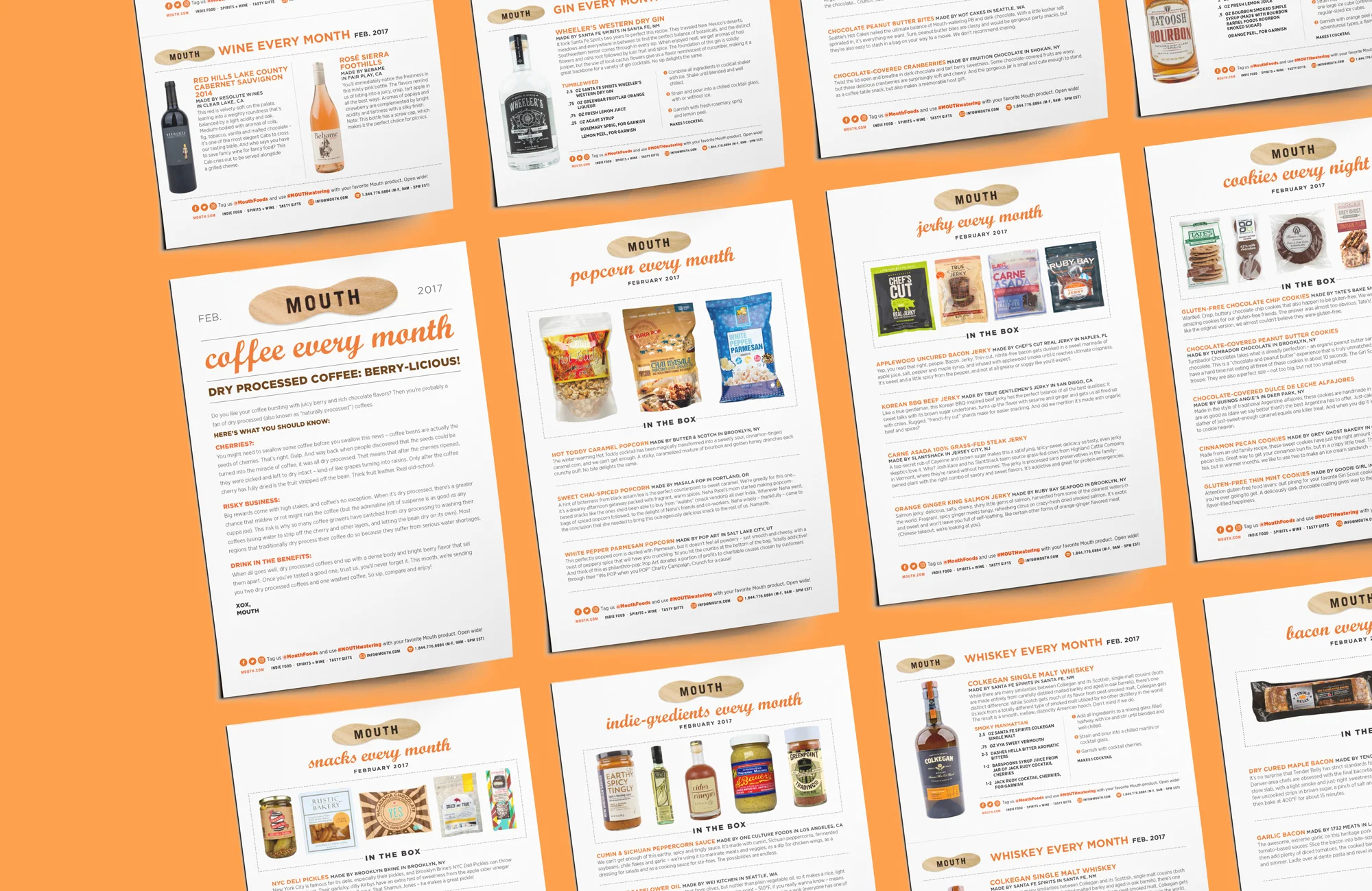
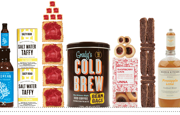
MONTHLY SUBSCRIPTION BOXES
Mouth is an online retailer for craft food and drink, all made in America. They also offer monthly subscription boxes, with a different set of themed and curated products in each box every month.
The goal was to create a more educational monthly box experience for customers, and create a streamlined way to delivery stories to each box. We evolved our subscription cards from just a theme name and month number, to a sheet filled with maker stories, recipes, and product contents, so the customer has a better sense of where their new snacks come from and why we curated this box for them.

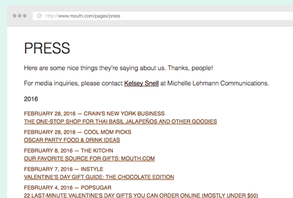
PRESS PAGE
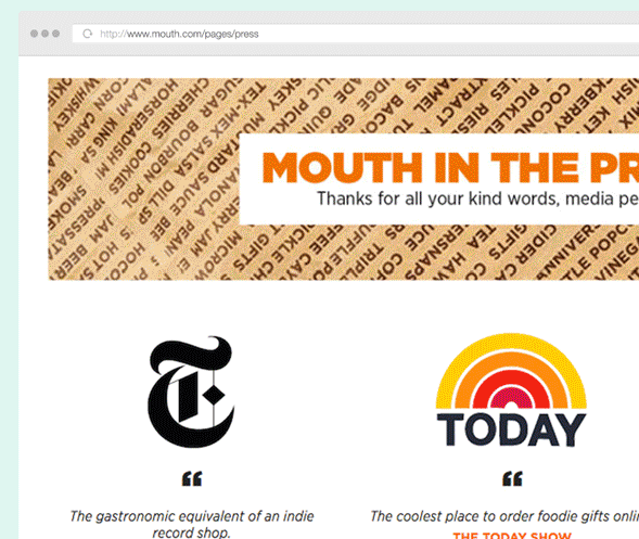
Mouth's Press page had been updated frequently with note-worthy articles and features, but as the mentions grew, the standard HTML list of hyperlinks grew and became hard to track quality over quantity.
The re-design of the Mouth press page aimed to let the best accolades and quotes shine, to give customers clearer reasons to trust Mouth.com as a great food gifting destination. The footer still features all previous years and archives, in case others would like to do more research.
__
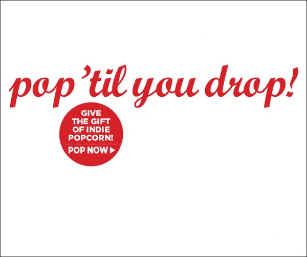
EMAIL NEWSLETTERS

EMAIL NEWSLETTERS
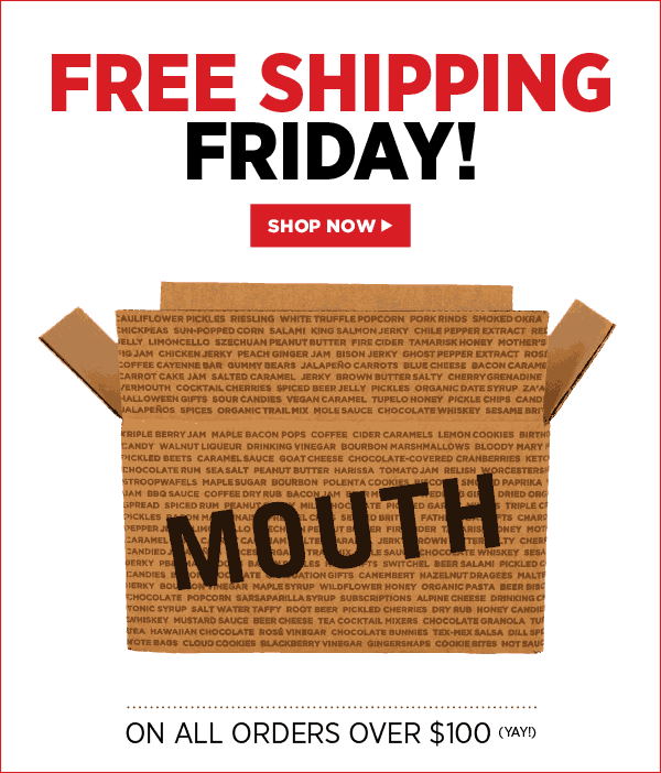
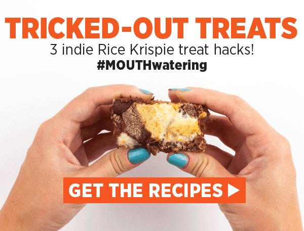
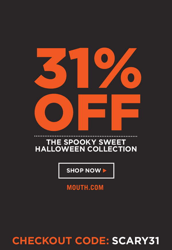
My new revisions to the email design process at Mouth involved optimizing designs for mobile viewers, introducing more HTML for better clickthrough rates, streamlined MailChimp templates, and overall improved legibility with bigger images and text.
___
Below are some of my favorite animated GIF emails I designed (Click to see the full email):
more of my favorite emails:
• Have a Sweet Year, Honey!
• Superbowl Snack Off
• Sriracha-cha-cha
• Mezcal & Tequila
• National Coffee Day
• PB&J Hacks
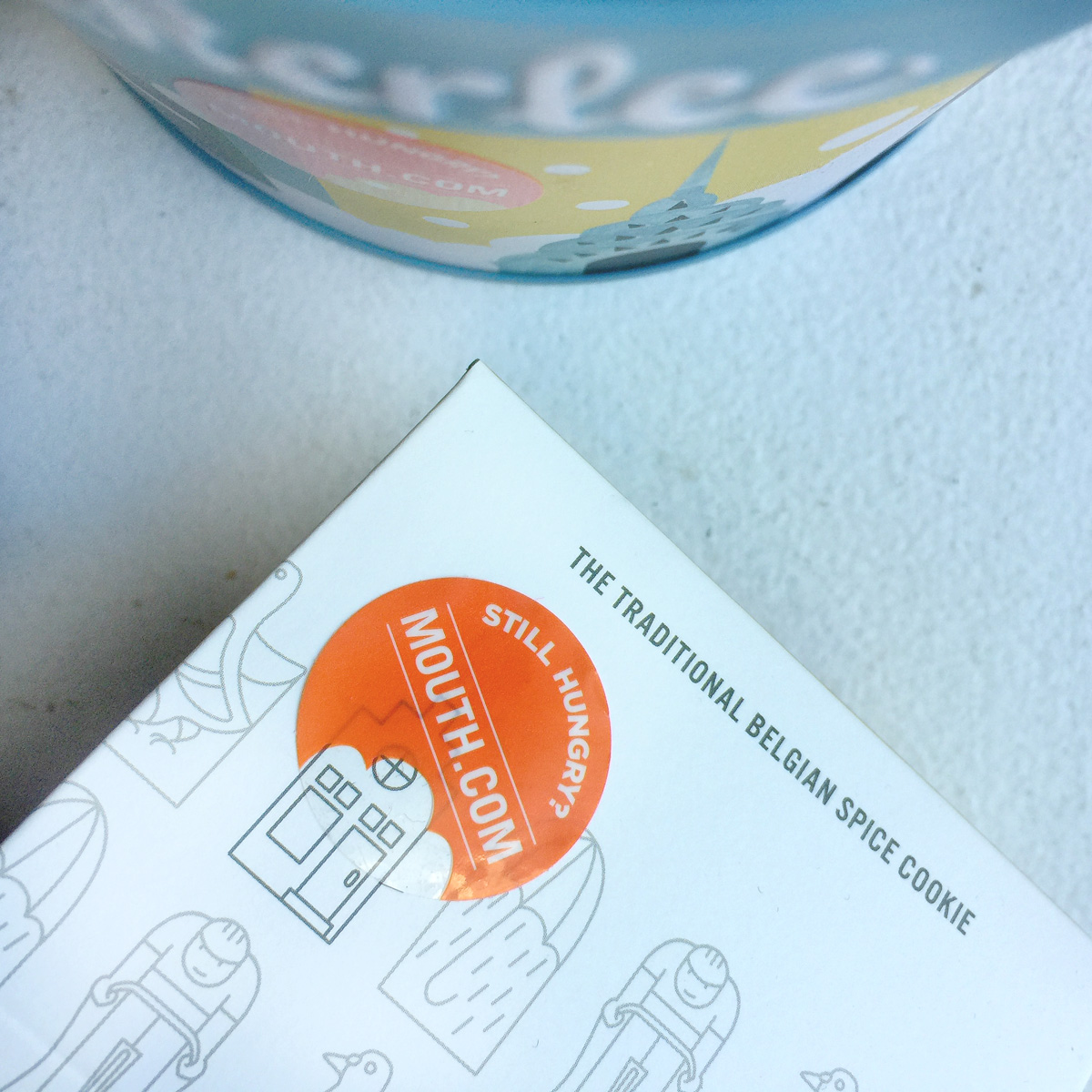
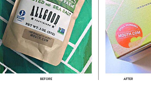
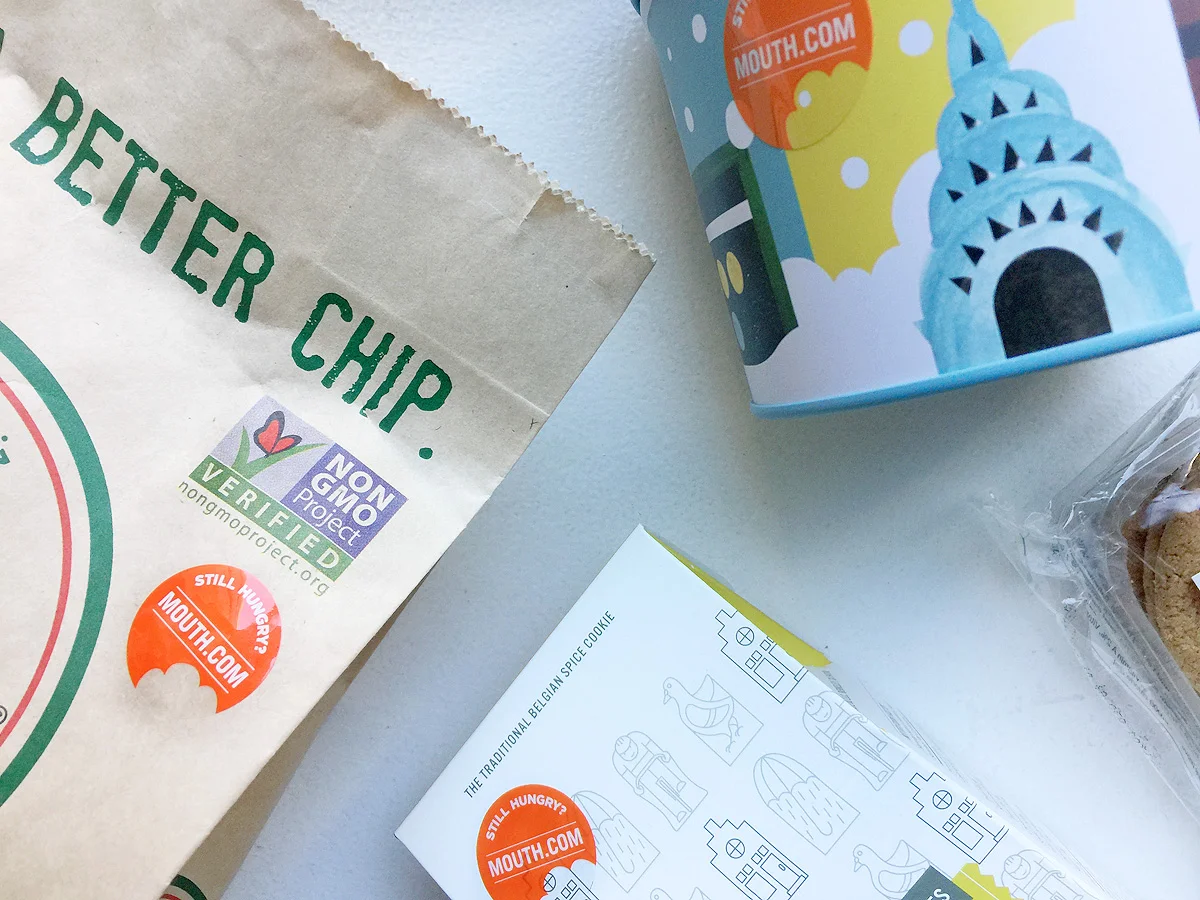
MOUTH RE-ORDER STICKER
When customers order individual products on Mouth, the fulfillment warehouse places "re-order" stickers on the package, to remind customers to go to the site to make another purchase. This sticker was printed on a thin kraft-colored rectangle, often blending in with the packaging itself and in a small font that was tough to spot.