Mouth Homepage Re-design
The goal of this project was to shift the focus of Mouth's homepage at first glance from an a la carte product site, to a lead retailer in craft curated food gifts.
Some main issues I wanted to address in the re-design were:
Overall over-crowding of content - find ways to say more with less and give our colorful photos more room to breathe.
A tight navigation center - The nav and header is the first thing a visitor can see on a homepage. How do we make shopping and discovery easier from the start?
A tight left side bar - an image heavy side bar that isn't navigation is limiting to the other real estate on the page.
Hierarchy of type to image - Mouth has such clever and creative copy, the humor in collection titles can get lost when they're the same size as lesser elements.
Small mailing list sign-up box - How can we grow our email list through design?

Below are some designs that didn't make the final cut, but I'm proud to share:
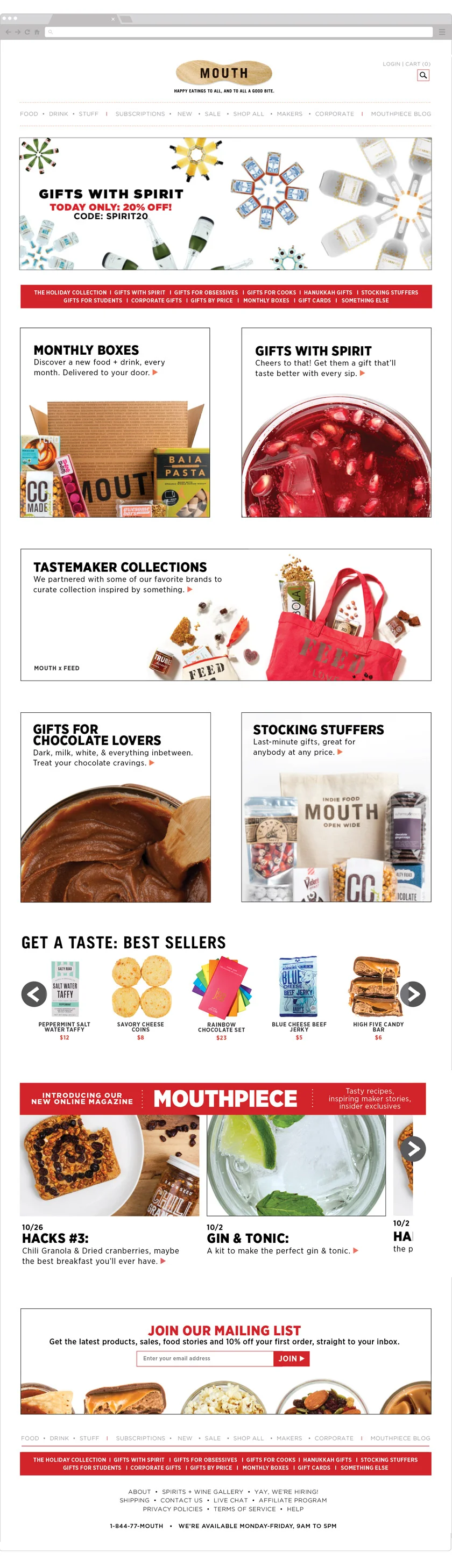
RE-DESIGN MOCKUP #1
UPDATED NAVIGATION
The new navigation design features categories on a white background, giving each link more room to breathe and to be read more successfully. The logo is also in the center, more symmetrical and prominent for site branding. Login and Cart status is also more prominent, to remind shoppers about their order.
WHY GET RID OF CAROUSELS? Here's Why
SEASONAL NAVIGATION
To help the shopper easily find special collections for holidays and seasonal sales.
COLLECTION HIGHLIGHTS
Buttons that feature specific gifts, partnership collections, and themes now have more white space and a bigger visual footprint to shine colorfully. Bigger images with HTML display text makes the offerings more appetizing and make it clear what you get upon click-through.
SHOP PRODUCTS
A gallery of individual products lets shoppers peek at the variety of the Mouth collection, without dedicating the whole homepage to solely individual products.
The gallery can be changed to feature any collection based on the season or marketing push.
BLOG CONTENT
Mouth launched "Mouthpiece", an online magazine of original food media content written by the Mouth Team. This section highlights the latest articles, to generate more traffic to the blog, and give customers incite into how to take what they buy at Mouth and bring it to life through recipes, gifts, and more.
EMAIL SIGN-UP
Many of our most loyal customers have been proven to come from our weekly email newsletters. Giving a sign-up section and discount incentive importance on the homepage can give a shopper a feeling of F.O.M.O, and will increase conversion as we pop up in their email inbox with sales and exclusive deals.
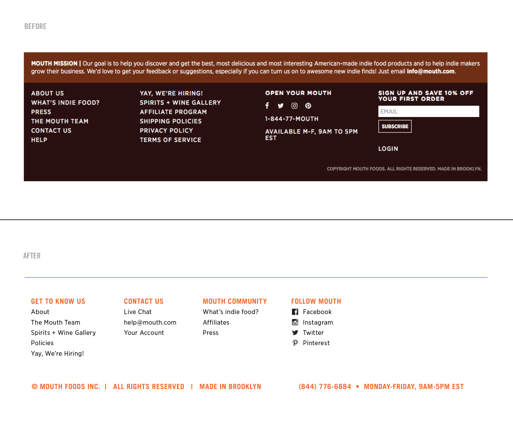
NEW FOOTER
Bring it back full-circle with a full navigation bar, in case visitors had a long trip scrolling down to the bottom.
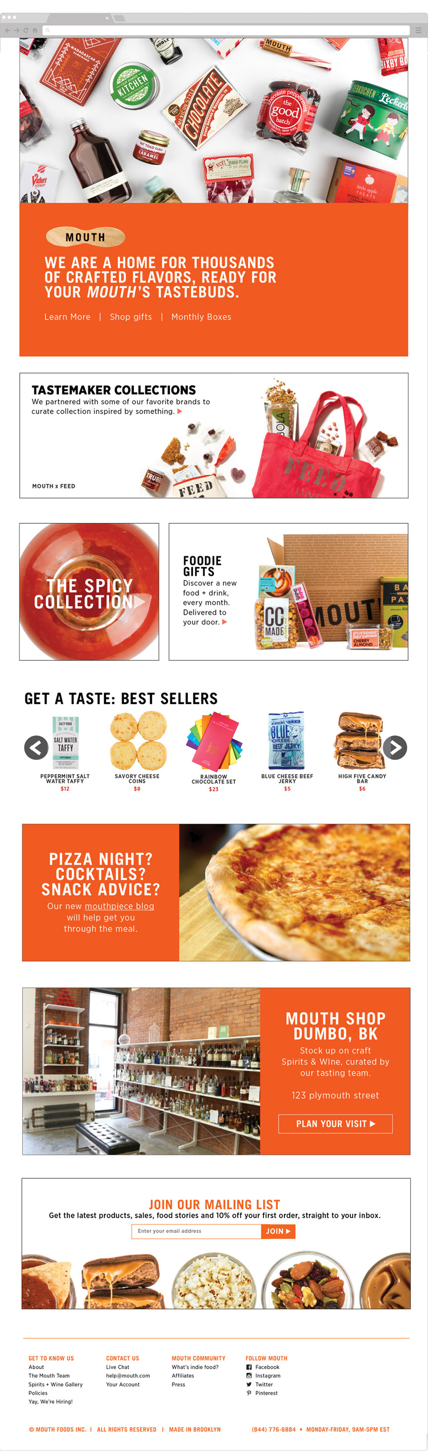
RE-DESIGN MOCKUP #2
THOUSANDS OF PRODUCTS
Mouth has one the biggest selection of artisanal food and spirits I've ever seen one online small-batch food retailer to have. The homepage of any website is the first impression a visitor has on a brand. We can open with showcasing the breadth of products we carry, along with the main brand mission/motto and an abbreviated navigation section to give that colorful overview.
COLLECTION HIGHLIGHTS
Similar to design #1, this design features three fresh collections that visitors can jump to right away.
SHOP PRODUCTS
Similar to design #1, this section features a la carte shopping.
MOUTHPIECE
Design #1 has a gallery style blog section. This design is more straight forward, a simple content block to guide you to the brand's blog.
SHOPPING IRL
Mouth has a brick and mortar store in Dumbo, Brooklyn. This content block gives that shop importance to give visitors to option to shop in-store and online.
This block was inspired by my research on Nike store webpages; I love how they gave a quick look into how the store looked as well as the address and how to get there.
MAILING LIST
A mailing list design, similar to design #1
UPDATED FOOTER
This footer design has more white space, and is listed in organized categories, so that navigation and customer service inquiries is more clear for the shopper.
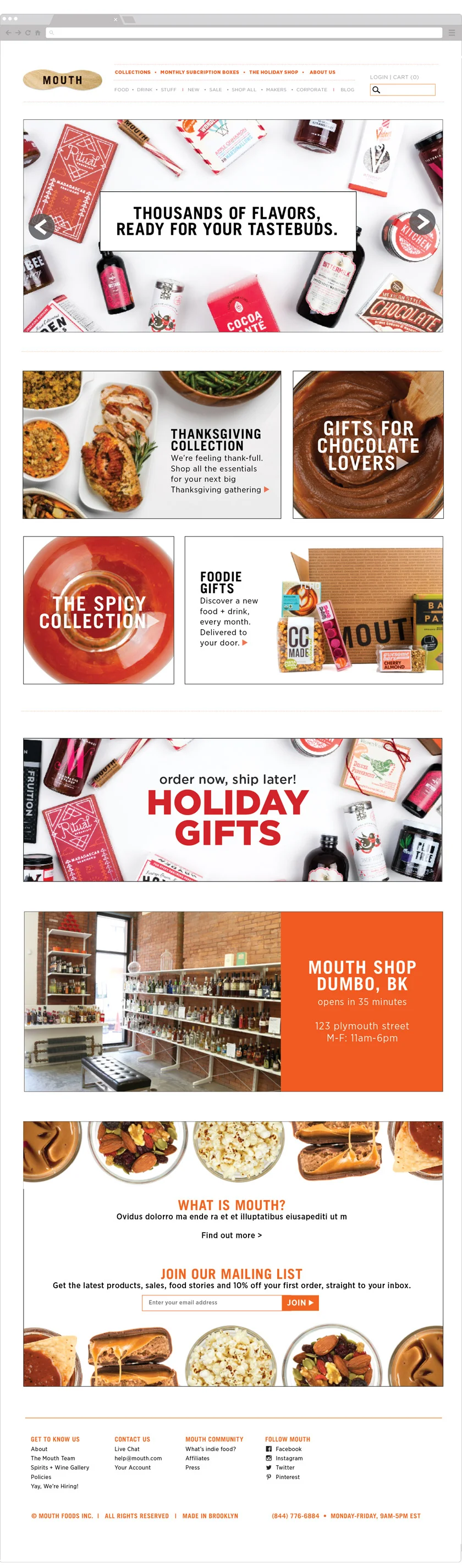
RE-DESIGN MOCKUP #3
UPDATED NAVIGATION
A little different than nav. bar #1, This design has two rows of links, for categories of different priority. The links are on white for more breathing room, and the logo and search bar sit on the sides for support.
THOUSANDS OF PRODUCTS
Similar to the concept of design #2, This hero image highlights the huge Mouth product collection, and entices you to shop for all these colorful eats.
COLLECTION HIGHLIGHTS
A two row section designed a-symmetrically for a dynamic page flow, focused on specific categories and collections.
SALE CALL-OUT
This content block can be swapped out whenever there is a flash sale or urgent retail message to advertise (Holiday collection navigation, free shipping day, order now ship later, etc.)
BRICK AND MORTAR STORE
Similar to design #2, this block features the brick and mortar store, plus a ticker to show when the store will open, to help shoppers plan their trip better.
ABOUT SECTION + EMAIL LIST
After scrolling through the offerings, the footer can help bring you back to the "why," with this about page section. It is also connected to the mailing list and new footer navigation.